Smartfile

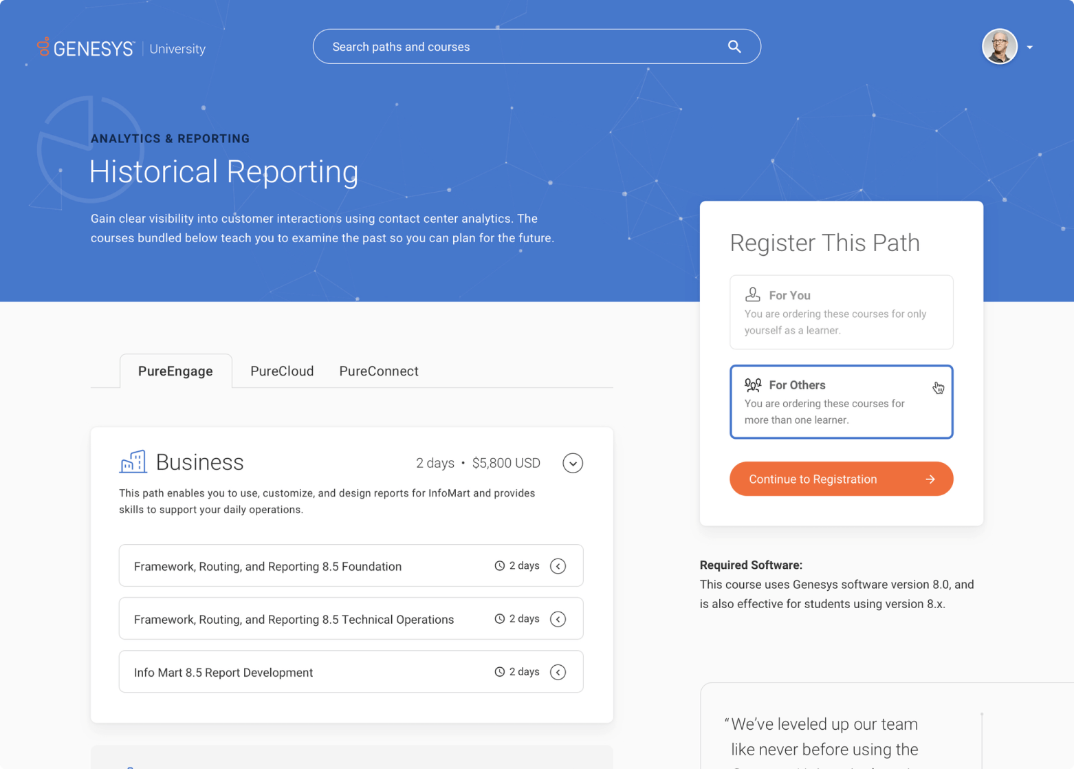
The visual design concepts explored themes of space and constellations to represent learning path connectivity and inspire customer success. Typography, iconography, and color palettes were primarily tiebacks to the corporate brand for consistency and familiarity.
Following an inventory of the existing site screens and functionality, I lead a series of workshops to align on our target user types, their goals, collaboratively map key user flows. Underneath the new UI is a completely overhauled information architecture that emphasizes the journey to certification. A primary expression of this was to ensure that each course was presented in the context of a learning path. Paths and other learning content discovered through user search, category-based exploration, or user-specific recommendations based on their role, behavior, and profile.

We knew that a sizable number of registrations were from managers of global teams at large organizations. It was important in to the redesign that we made bulk registration as frictionless as possible. Key factors to consider, aside from team size, were team location, timezone, and instruction type. Additional variables for registration included instruction type and availability, as well as course duration. The solution relied on branching logic as users progressively completed the registration form: we asked the most important questions up front and based on user input, as well as real-time course scheduling data, the next questions are dynamically displayed.

Following handoff, a restructuring with the Genesys University team lead to a rebranding and along with new packaging and positioning as ’Genesys Beyond.’ The internal team leading the rebranding later introduced and implemented a new UI for the GU experience.◼︎