Mightychalk
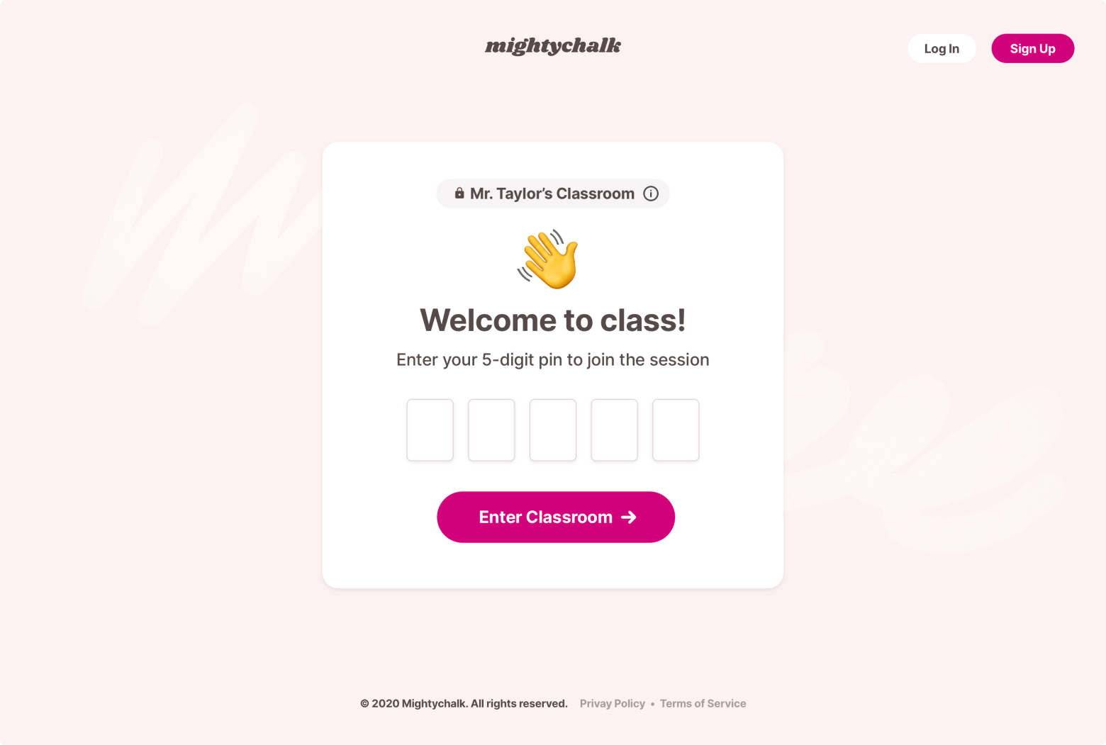
When designing any experience for children, privacy and security must be core to the design. The first step in creating secure digital classrooms was gating entry by default. This was not a toggle buried in a preferences menu, but an option that was default selected any time a teacher created their classroom and shared an link. A waiting room for all attendees would ensure that everyone is approved personally by the teacher.

Integrations with popular services, like Google Classroom, were explored to create better connectivity between Mightychalk and the digital tools teachers and students were already using. Teachers could pull their student list directly from Google Classroom to send direct invitations. And Google schools could easily pin relevant documents right to their “Class Pinboard” for quick reference and access.

I designed the primary view of each classroom to be the teacher and their class “whiteboard.” This solved a key gap in the Zoom product: a space for actively sharing ideas, illustrating concepts, and just writing something down for the class to see. The focus is on the canvas, but the teacher is always present. And the design itself was crafted to be approachable and familiar, but fun. Playful personalization options like illustrated avatars and real-time polling for input helped to round out the product.

Partnering with friend who focuses on full-stack development, we explored bringing the product to reality. After investigating a number of WebRTC video room services to power our solution, given the significant amount of time classrooms would be live each day, we could not find the right balance between our ideal pricing model for schools and operational costs. An important additional consideration was the longevity of the problem we were working to solve, as many schools began to return to in-class instruction before we could complete building our proof of concept. ◼︎